At standup the other day a coworker wondered why she never lost power when her surrounding neighbors all did. Being a group of software engineers, several folks, myself included, spouted off theories about being on different circuits, or knowing the area the coworker lives, perhaps she was on the same feed as the near by hospital and got priority? We pontificated for a few minutes then carried on with the actual business of the meeting. I, however, was nerdsniped.
While eating lunch, I wandered through my repository of GIS links, remembering that I had seen at least transmission line data in the California open datasets. A few searches and ESRI map dissections later, I discovered public GIS portals for both SCE and PG&E, threw them into QGIS and got to playing. After exploring the available feature servers for a while I found appropriate FeatureServices for what I wanted and was able to build a map that would answer my questions. Once I figured out how to categorize items by fields, I had color coded named circuits, substations, transmission lines by kV rating. Pretty quickly we were able to identify that we had no idea why she so rarely lost power, must just be a fluke of local wiring, but I had a ton of fun. I duplicated all my efforts for PG&E because even though Santa Barbara City and most of southern county is SCE, North county and Santa Ynez, where I am located, are served by PG&E. What fun is digging into electrical data if I can only do it for others, but by covering both major carriers I now have a map covering most of California, outside of local cities and majorly, LADWP.
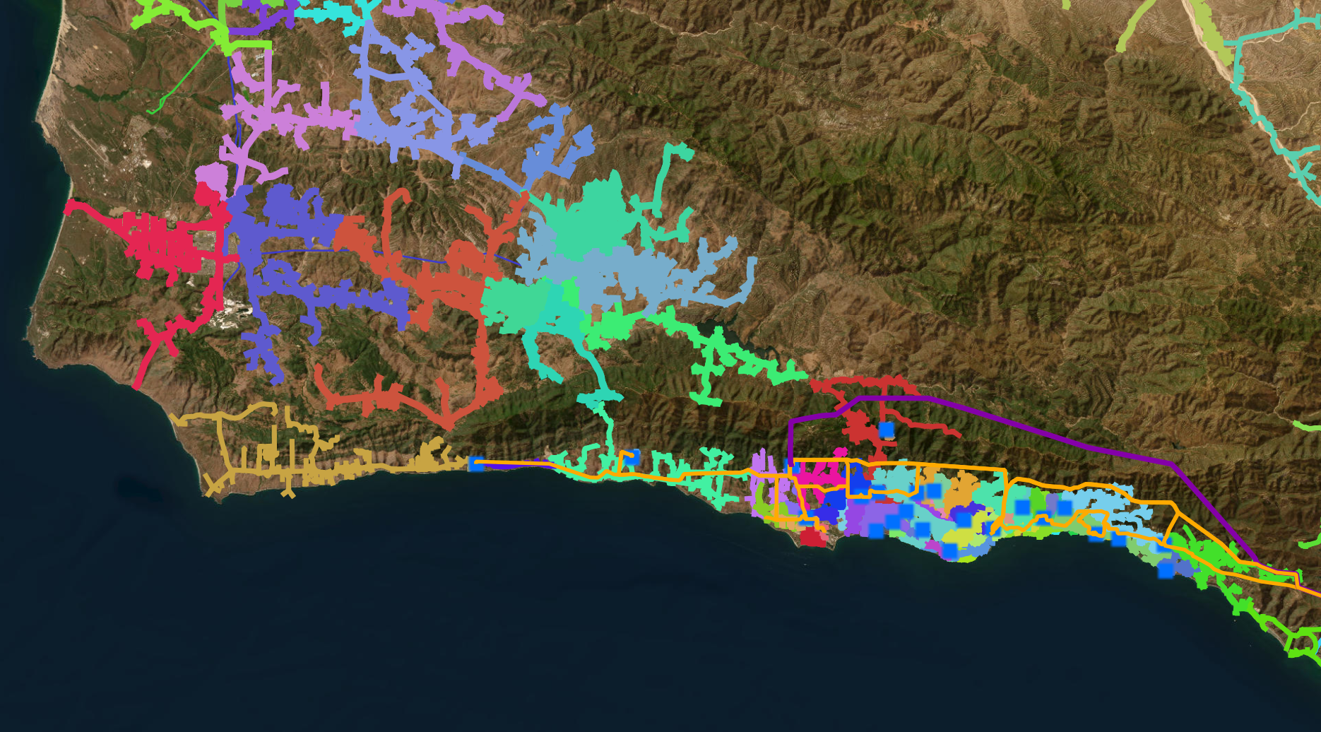
Screen capture of QGIS showing Power Networks Santa Barbara County at a high level.
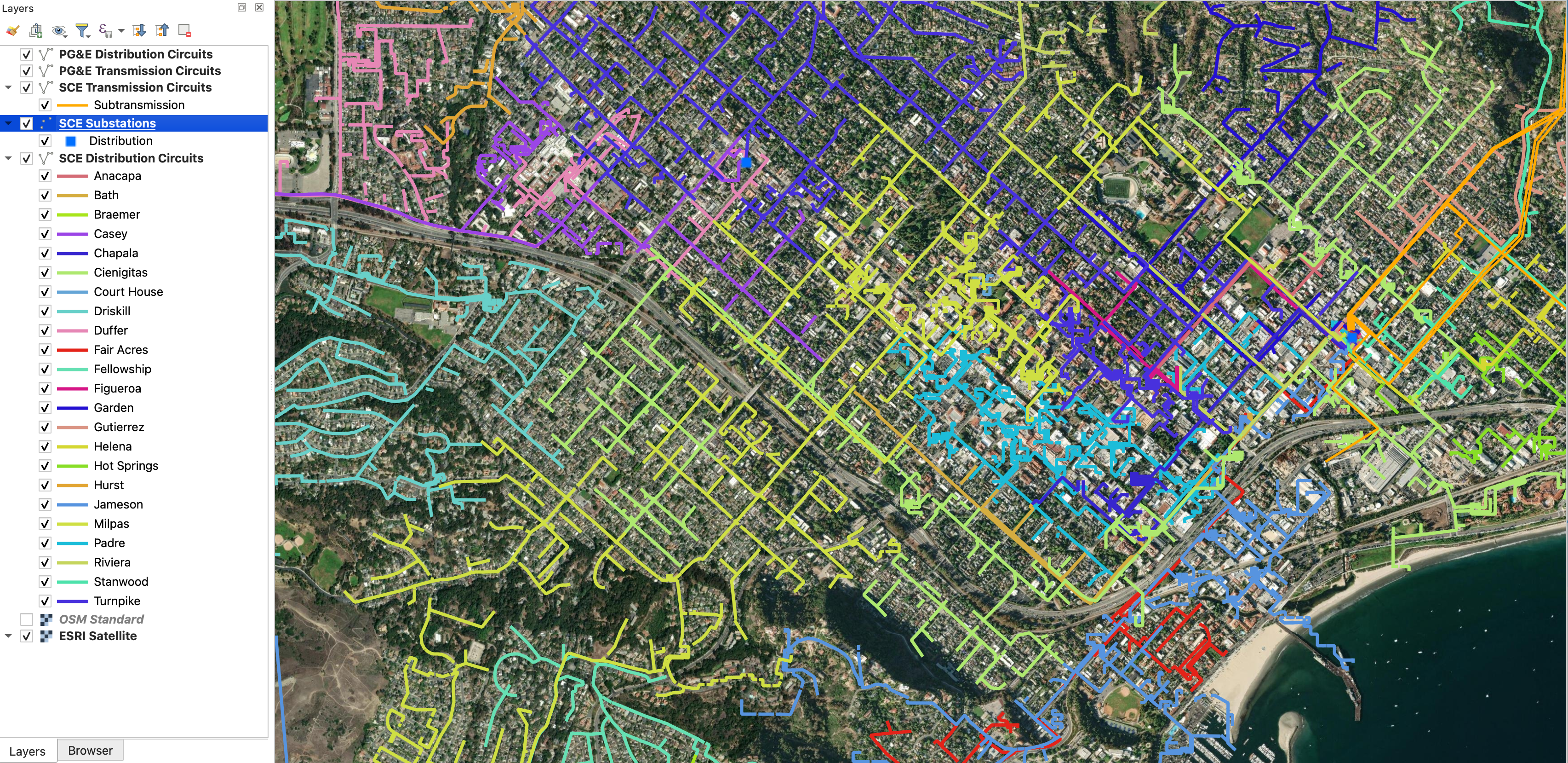
Screen capture of QGIS zoomed in on downtown Santa Barbara City.
This was a fun exploration into QGIS and public datasets, while not my first time in the area, it was one of my more directed journeys and I actually had a mission to discover something. As far as what QGIS can do, I barely scraped the surface, however I was pretty quickly able to build a custom map, from a handful of different datasources, interactive and tailored to my interests. Next up, cartography?